Thursday, June 25, 2009

Wallpaper, I'm so glad you grew out of your awkward stage.

Wallpaper and I, we have a history. When I was a little girl, we had wallpaper in our house -- a lot of wallpaper. During my pre-school years, circa 1987, my mom created a Precious Moments bedroom for me. I thought it was extremely glamorous. Like any good DIY mom, we worked on the wallpapering project together and I picked up on the technique. (I'm sure I was incredibly helpful). In fact, I felt so helpful that later on when I was alone in my room, I took the initiative to line the shelves of my closet with the wallpaper border. I've always been such a go-getter. My mom was thrilled, as you can imagine. That experiment helped me to begin to grasp the relative persistence of wallpaper. It's a lot of work to install so you'd better make sure you love it now and will definitely love it later.

I hate to disappoint, but I do not have a picture of that room! Instead, I found a shot from my second wallpapered, themed bedroom. Introducing ... unicorns!


A third room featuring Native Americans and galloping horses may also exist ... but that will have to wait for another day.

As fun as it was to have (creepy) dolls with big eyes, unicorns with pink hair, and galloping mustangs on my walls
back then, I couldn't be more pleased that new, wonderfully modern papers are now readily available. So for the first time since 1994, I am planning a wallpaper project!

The plan is to put beadboard in our powder room with a fun wallpaper on the top half of the wall. Most of our house is the golden-yellowy color of
Compatible Cream from Sherwin Williams.


The dining room is
Uncertain Gray but looks very blue compared to the online shade.

I've been considering a few patterns for a while but I'm incredibly indecisive. Maybe it's because I'm a Gemini. Or maybe I could blame my being a middle child. I'm just not sure ...

So enough of that. What papers are your favorite for adding drama and style to a small space?

Chenonceau in Bisque


Xanadu in Glacier


Graphic Panel Stripe in Spring


Daydream in Yellow


Traviata in Beige from Graham & Brown


Vivid in Cream


And for old time's sake...

Pink Donkey


Do you have any beautiful suggestions for me or papers that have you ready to commit?

Monday, June 22, 2009

A shot of creativity

My buddy Michelle over at Mitch & Winnie introduced me to How About Orange, a place I can always turn to for a dose of creativity when life as a technical writer starts to feel like a dark abyss of monotony. This morning, Jessica posted a link to some design inspiration resources and I am flabbergasted and twitterpated by the raw creativity. Here are some of my favorites from Business Card Collector Kariann Burleson's Flickr Stream:


Swoon! You really must go check them out for yourself.

When asked why she collects business cards, Kariann replied:
I see the business card, calling card, and name card as tiny works of art, or even poems, as they express a brief visual narrative of something so much more. They are an introduction - an affectionate piece of evidence, a receipt of a connection, a meeting, a moment. It's this nature of the business card or calling card that enchants. They are generally intended as small, brief, and hopefully, possibility invoking pieces of paraphernalia. They encapsulate tangibly and visually the essence of something that is a transient. They bridge a gap between two people, sources, or ideas using humor, novelty, beauty, art, even cryptic information. They are parcels of possibility, relics of remembrance, they say, perhaps in a whisper, perhaps a shout 'remember me.'
How lovely. I couldn't agree more.

Thursday, June 18, 2009

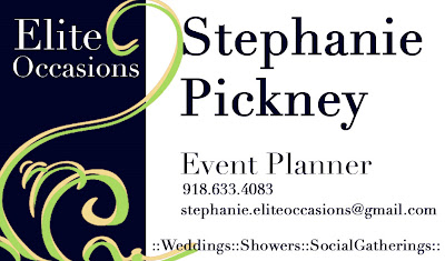
Elite Occasions by Stephanie

When it comes to event planning, my dear friend Stephanie over at Aisle with Style just has a gift. She is creative, organized, and has exquisite taste — a rare combination that results in unique and memorable occasions for all of her clients.

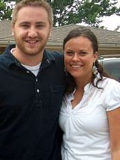
When we worked together right out of college, she faithfully fulfilled her role as bridesmaid by taking part in brainstorming sessions, gently washing away my naivete when it came to wedding etiquette, and accompanying me on late-night drives into the sticks of the Missouri countryside for fittings at my seamstress' home. Stephanie is the sort of friend you like to keep around. Even though life has geographically separated us, we keep in touch any way possible and visit when we can. Here she is at the Cherry Blossom Festival in DC when she came to visit me just a few weeks ago.


She came to visit me all the way from Tulsa, Okla. Wasn't that nice? Back home, Stephanie works for an environmental and combustion company by day and in her free time she plans events. (It really is fun for her.)

Here is the look we put together for her business cards.

Front:


Back:


Make sure to check out her blog for updates on events she is working on and practical tips and advice for making the most of your own occasions.

Wednesday, June 17, 2009

I love weddings

There's nothing sweeter than witnessing the vows of a couple that you really love and who truly love one another ... except maybe seeing the beautiful wedding pictures captured by an extremely talented photographer. Some wonderful friends of ours were married on May 30, 2009. Here are a few pictures of the pictures captured by Sesha Shannon of Convey Studios.


All images are from Convey Studios.

Congratulations to a lovely couple.

Friday, June 12, 2009

Some old memories and the inaugural Quill & Varnish project

Back in 2003, I started working for my college newspaper on the second floor of a run-down building that has since been demolished. I loved that old office. The filthy, 1992 sofa was a Godsend when you were stuck trying to get the next issue out -- waiting on a slow/procrastinating staffer to finish up a story or a ridiculous FTP error to magically resolve itself. And the window that allowed us to climb out onto the roof to look at the stars and spy on students walking across campus after dark felt like the entrance to an exclusive club. (What can I say? We were easy to please.) The Lance was one of the only places where I, as a first-year student, had the chance to talk to (okay, eavesdrop on) out-of-my-network, darn-near brilliant upperclassmen discussing the woes of the world and the shortcomings of our Christian liberal arts university.


But really, what drew us all to that hot upper room were Mac desktops. At the time, it was the only place on campus where they resided (as far as I know). If you weren't already aware: All journalist-type people love a Macintosh computer. Staffers could complain about virtually anything and we would all chime in (journalism students, critics; potato, po-tah-to), but if someone expressed discontent with their Apple machine, most would look down and shake their heads. This person obviously had a lot to learn.
I had a lot to learn as well (some things will never change). I had never used an Adobe Creative Suite product and my torrid relationship with Photoshop began in that very office. Friends (who must not know any real designers) have approached me for help on personal projects and have been the motivation behind Quill & Varnish. Now that I work as a technical writer and spend my days glued to Microsoft Word documents, any time spent with design elements and color (!) is considered very welcomed play time.
This is my friend Emily (and her husband, Curt).


She works for a lovely church where they wanted to do some re-branding for their womens group. They were looking for something fresh. So imagine my surprise when she asked for my help! After spending a few minutes thinking about the hundreds of other people who would do a better job, I told her I'd give it a try. And here is what we came up with ...


This looks so straight-forward. Ya. Okay. The True Hollywood Story of this logo is that I purchased the dandelions from iStockphoto (God bless the artists who can draw those perfect vector images. I would love to learn how.) I found new respect for them when I just had to figure out how to draw vectors to make the little frame. But, the hardest part was definitely the color. Finding the right shade of coral -- not too pink, not too orange -- is no cake walk. (Sidenote: I'm a bit nuts about color. I have painted our living room three colors and will always be surprised by how different colors look with various types of lighting once it's all over the walls. Sometimes I want a color to look a certain way, and I'll convince myself it really does!)
But, neuroses aside, I really like how the palette turned out. It includes my current obsession with gray.
Following the basic logo, we also worked together to design a huge upright banner to grab gals' attention when they came in for service Sunday morning.


And that same Sunday, the church also announced the launch of the new Web page. I love what the designer did with the original idea. It's so happy and welcoming!


Thanks Emily for the chance to work with Women at Central.I learned a lot and I enjoyed myself to boot!
More design-work-for-friends projects to come. Have a splendid weekend!